Audience
This guide is intended for anyone who plays a role in creating, extending or describing the Synchronous Health brand.
The purpose is to ensure that consistency is maintained across the Synchronous Health brand, whether assets are used internally or externally. Please reference this guide whenever you use these assets to ensure that they are used correctly.
Mission Statement
To achieve the best of what it means to be human thus creating a kinder world, resulting in better health, higher productivity, better experiences, and lower costs.
Value Proposition
Kindness means better health, resulting in higher productivity, better experiences, lower cost.
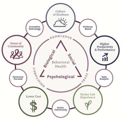
Our value proposition means empowering people, communities and systems with knowledge, compassion, trusted experts and relevant resources that lead to sustainable change and wisdom.
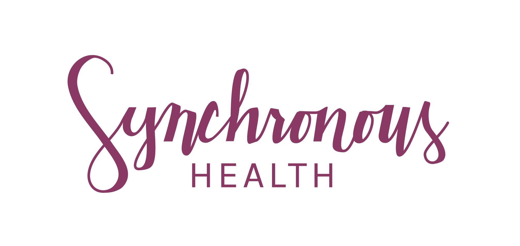
Signature
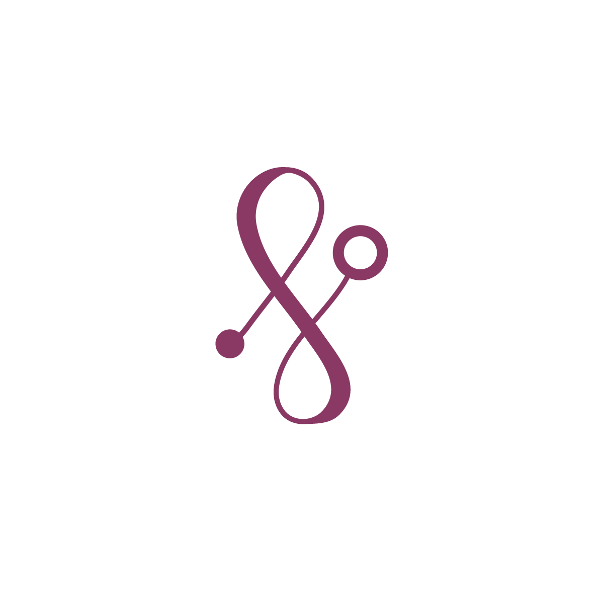
The Synchronous Health logo signature combines the two most important visual elements of our brand:
- the Karla mark of the Synchronous Platform and artificial intelligence
- a custom script that symbolizes a flexible path of understanding a kindess

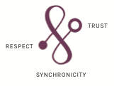
The dots indicate the individual and community and how they support one another. The line is an path of growth and understanding, it’s meant to feel like a pleasant fluid motion. The icon has three parts: the pillars of trust from which respect is derived and how they balance in a synchronous path.
To maintain consistency across the varied applications of the brand, only three configurations of the Synchronous Health signature are permitted:
Vertical Signature
Use this when both Karla and Synchronous should be represented.
Download SVG EPS PNG
Script Signature
Use as default trademark for Synchronous Health, and/or when the Karla icon is shown elsewhere on the page
Download EPS WHITE EPS PNG
Karla Device
Used to represent the platform, where consumer action is likely (e.g., a button, app-store logo, etc.), or where third party requirements dictate a small square or circular icon
Download Simple EPS WHITE EPS PNG
Download Circle EPS PNG
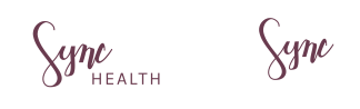
Alternative Signatures
Special versions of the signature may be used for Sync Health Labs, the abbreviated Sync Health, and in horizontal banner format. However, these should only be used sparingly and generally with branding team permission.
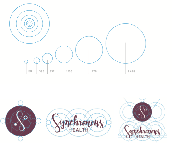
Grid systems
The grid system and module scale for synchronous dimensions is purposeful. Derived from the golden mean, it can be used to find margins and develop an icon system. Like the mark and the brand, there is flexibility within the system. It acts as a guide not as a dictator.
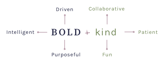
Brand Personality
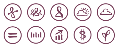
Icons
Hand drawn icons are used to represent various elements within the Synchronous ecosystem. The icons were designed with free-flowing lines that were hand drawn before being edited and digitized. The organic nature of the icons conceptually fit with the idea that human health and the digital world can work hand in hand.
Colors

Gentle but bold
CONFIDENT STABILITY
KIND REFLECTION
COURAGEOUS GROWTH
PATIENT TRUST

Typography

Both fonts were curated for Synchronous Health and licensed to us under SIL/OFL.
Source Serif Pro is a modern serif based on traditional serifs. This was designed in 2014 and optimized specifically for digital use; it is typically used by us in headers. Karla is an approachable serif designed in 2012; it should be used wherever we are describing Karla.
Trivia note: the font Karla was selected independently by our design team on the same day and without knowledge that Karla was named.
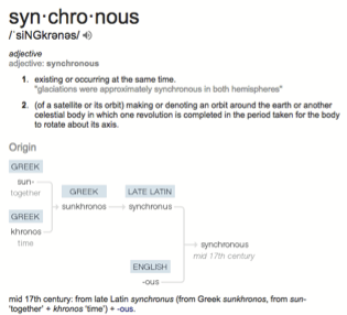
Name
The Greek translation is: Together Time.